I was a little apprehensive about booking the flight earlier this year, hoping that perhaps prices would lower. Silly me! I mean, I know prices generally get much higher the longer you wait, but I assumed they wouldn't really start increasing until a month or two out.
Well, when I checked yesterday, the price of our desired flight went up $20 since I last checked! I know, not horrible, but that certainly meant prices were on the rise! And I didn't want our desired flight to sell out! It was one of the few with decent departure/arrival times and short layovers (you know, under 16 hours...). So,the price increase, along with the gentle reminder on the knot's checklist encouraging me to book our flight, was all I the encouragement I needed!
Now, our next step is getting our passport applications in! We have the photos taken and the forms filled out - now we just have to gather our birth certificates and make photocopies of our driver's licenses. And we have to remember to bring our driver's licenses with us to the post office. And a credit card to process the $100 fee for each of us. I hope I'm not forgetting anything...
Ciao,
Friday, August 28, 2009
Wednesday, August 26, 2009
The Joys of Shoe Shopping
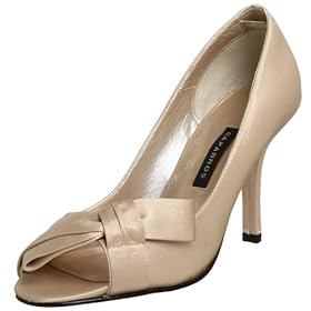
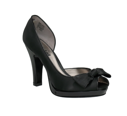
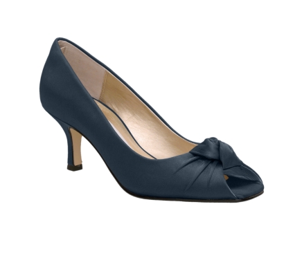
Who would have thought finding the perfect black bridesmaid shoe would be so hard?
Too edgy...
Too beachy...
Too fierce...
Though my MOH encountered quite a few duds yesterday, we're trying again on Friday! At least this time we'll have a better idea of what we're looking for!
Saturday, August 22, 2009
80's Chic Rehearsal Dinner
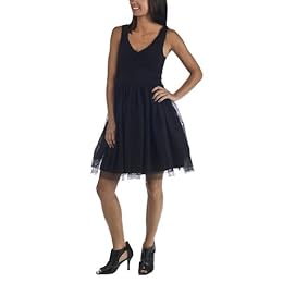
Anyone who knows me knows that I love clothes! Ooh, and don't even get me started on shoes! So, is it any wonder that the theme for our rehearsal dinner was inspired by a dress?
I'm hoping our guests will get into the theme as well. At the very least, our wedding party will be rockin' some leggings, aviators, moto jackets, or neon colors!
Ciao,
This dress was completely love at first sight! And at only $29.99, it's a total steal! Gotta love Target!
I'll admit, it looks a little wonky on the model, especially with those tragic shoes, but it looks crazy cute with my pink pumps, patent leather black belt, and layers of pearls!I'm hoping our guests will get into the theme as well. At the very least, our wedding party will be rockin' some leggings, aviators, moto jackets, or neon colors!
Ciao,
Tuesday, August 18, 2009
Fun with Monograms
Well, I finally bought into the monogram trend! I initially thought it was kind of silly since I didn't think I'd have to many places to put one. Well, that was before I figured out I'd need something to connect the ends of our invitation belly bands! So, it was "hello, monogram!"
I was pretty dead set on incorporating our damask theme into the monogram design. So, here are my various iterations of the damask monogram...
The first monogram I came up with mimicked our invitation and save the date design. I like it, but I thought it might be overkill! :) So, then I started playing around with just a single damask image...
Cute, but unfortunately, it's a little too hard to read. :( So, I tired to make the K a little darker...
Uh oh! Still can't read our names so well! And at its final size of 1.5" by 1.5", the text would be positively illegible.
Well, that's better! By flipping the color of the text, the monogram instantly became much more legible! Plus, I like that the pink and orange are both in the background. I can't really explain why, but it seems much more cohesive! :)
Once I figured out how to use Photoshop, it was relatively easy to create these monograms!
Ciao,
Monday, August 10, 2009
You Are Here
I love the look of custom-made maps for wedding invitations, but seeing price tags of $300 or $400 per map, I decided that good old Google maps would be good enough for me!
But that was before I saw this fab tutorial over on Weddingbee.com. Though Mrs. Ballet Flats used Microsoft Power Point, I used Microsoft Publisher instead. I imagine either program would be fine since they use the same tools, but, since I did all of my invitations stuff on Publisher, I figured I'd keep it up!
I really love the way it turned out. I have to do a test print to make sure the words are going to be big enough to read on the 3.5"x6" direction card, but I'm pretty confident that they are.
Ciao,
But that was before I saw this fab tutorial over on Weddingbee.com. Though Mrs. Ballet Flats used Microsoft Power Point, I used Microsoft Publisher instead. I imagine either program would be fine since they use the same tools, but, since I did all of my invitations stuff on Publisher, I figured I'd keep it up!
Here's how my first map turned out...
(Obviously, I changed the names of the major streets and rivers. Hehe, I don't live in a spy-themed town!)I really love the way it turned out. I have to do a test print to make sure the words are going to be big enough to read on the 3.5"x6" direction card, but I'm pretty confident that they are.
Ciao,
Tuesday, August 4, 2009
Bridesmaids' Gift - Phase 1
Subscribe to:
Posts (Atom)